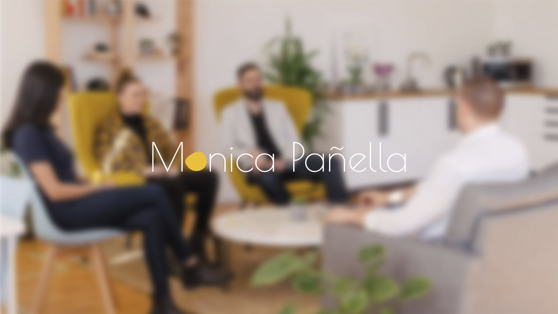
A visual identity and website design for a professional who makes balance her way of thinking and working.
Mónica Pañella is a consultant specialized in transformation, talent, and continuous improvement. Her perspective brings together clarity, method, and sensitivity: a way of working where the balance between people, processes, and change is the central axis of everything she does. She needed an identity capable of expressing this essence: precision without rigidity, structure without coldness, humanity without unnecessary embellishment.
Context
o translate her professional offering—analytical, organized, and deeply human—into a visual system that would be: • clear and minimalist, • conceptually solid, • and flexible enough to support her digital growth.
The identity had to be recognizable and sober, while communicating the idea that guides her work: balance is something you build.
The challenge
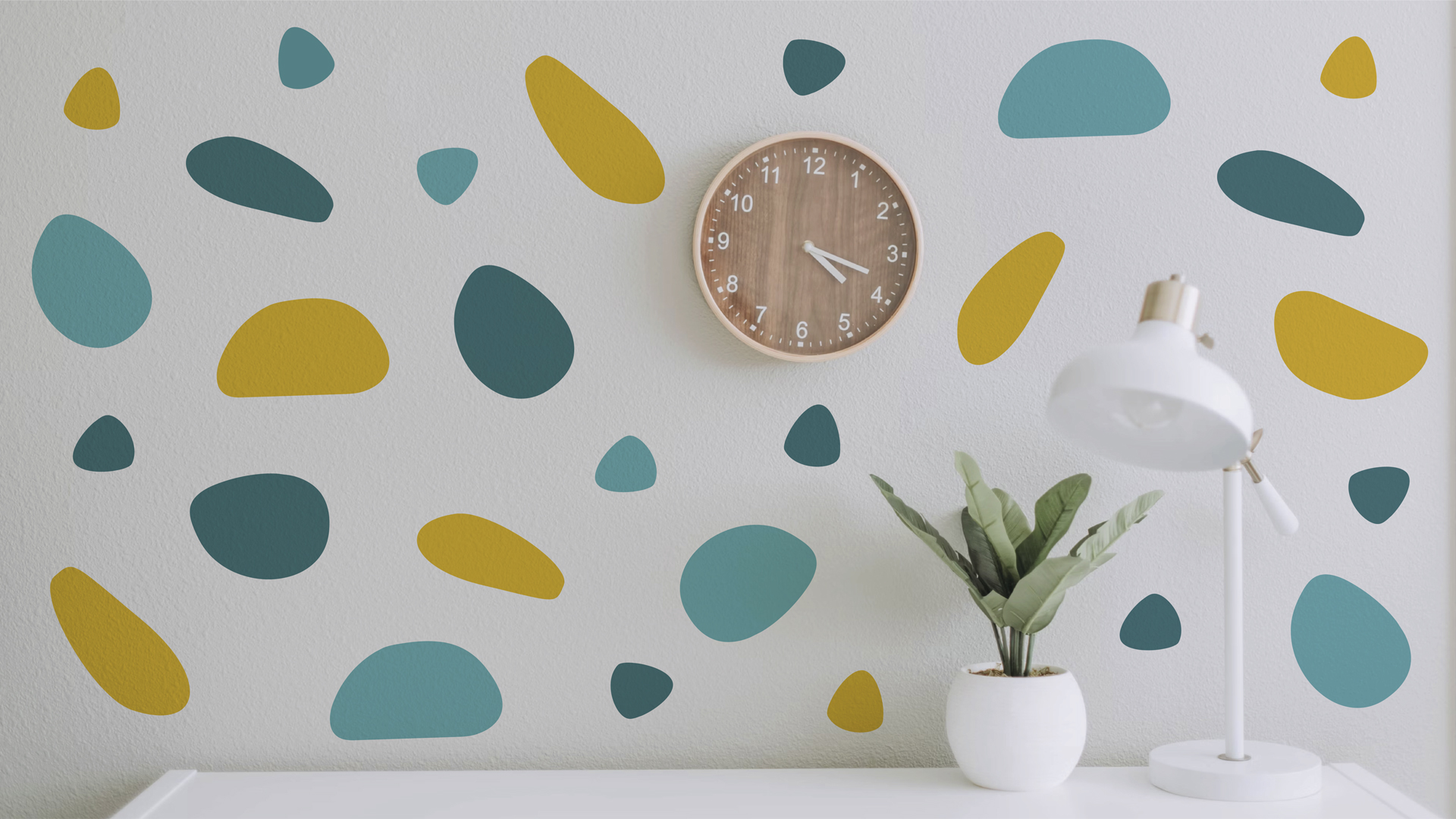
We started from an idea that appears throughout her methodology: balance as a process.
From this, a visual language emerges based on: • modular shapes that represent components that complement one another, • groupings and layouts that generate new meanings when reorganized, • a clean and calm system aligned with the clarity she aims to create within organizations.
This approach allowed us to create an identity that is not decorative but conceptual: a balance that can be seen and understood.
Brand concept
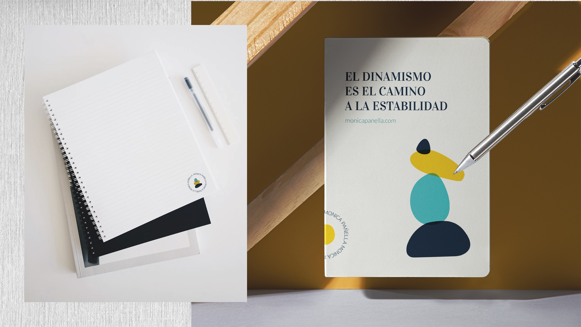
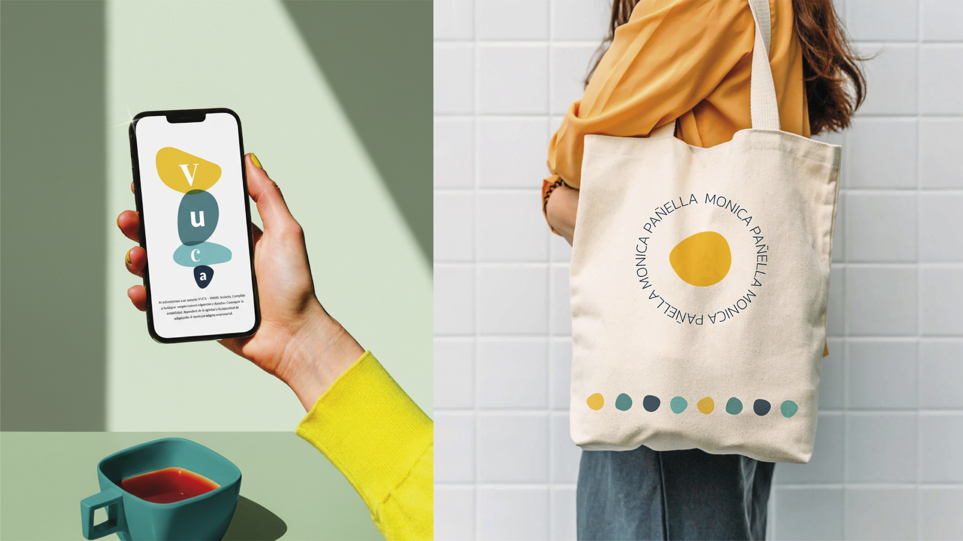
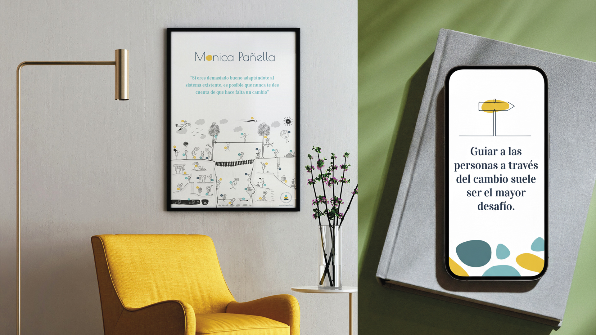
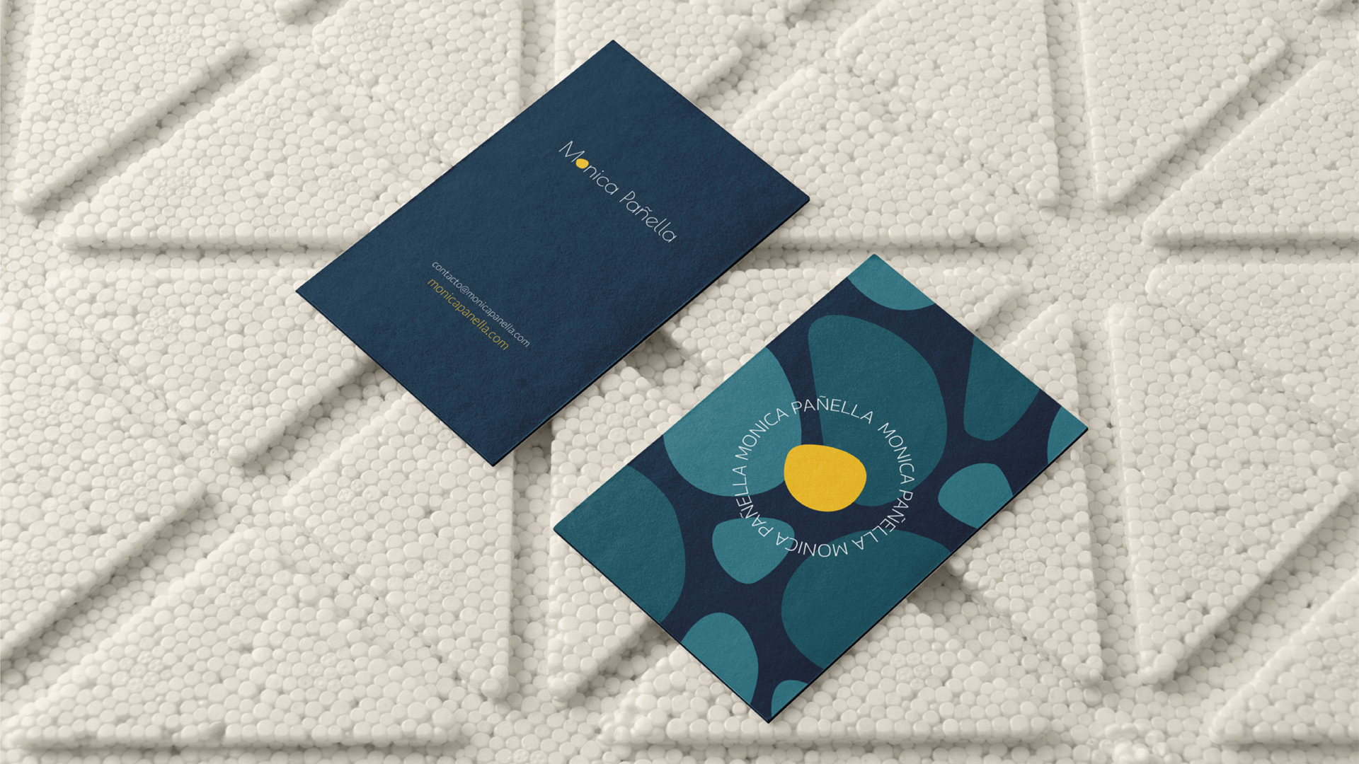
The identity is built on a flexible graphic language composed of simple geometric modules that can be stacked, balanced, or expanded depending on context. The result is a professional and contemporary aesthetic, based on: • a neutral palette with minimal accents, • sober, technical typographies, • compositions where space breathes, • and visual pieces that convey order, stability, and precision—without losing warmth.
The system works across both digital and print formats and reinforces the idea of structure in motion.
Visual identity
The website was designed as a natural extension of the identity: clean, clear, and focused on communicating value without noise. We prioritized: • simple visual hierarchies, • a calm rhythm between sections, • strategic use of modules as graphic resources, • and a fluid reading experience where each element supports Mónica’s professional narrative.
The site reflects her personality: direct, honest, structured, and strongly process-oriented.
Website design
A visual identity that is balanced, coherent, and intentional. A graphic system that represents her way of thinking and working. And a website that communicates order, trust, and professionalism—without losing humanity. A brand that strengthens her presence and supports her growth as a consultant.
Outcome
Claim your freesession
No commitment to hire
30 minutes with experts
Free and virtual
We would like to invite you to a personal session to get to know us and discover the potential of your project. We will listen to you, analyse your project and give you some ideas.
We would like to invite you to a personal session to get to know us and discover the potential of your project. We will listen to you, analyse your project and give you some ideas.